Page 1 of 2
[Abandoned] - Boston Map

Posted:
Fri Feb 29, 2008 3:35 amby oosik
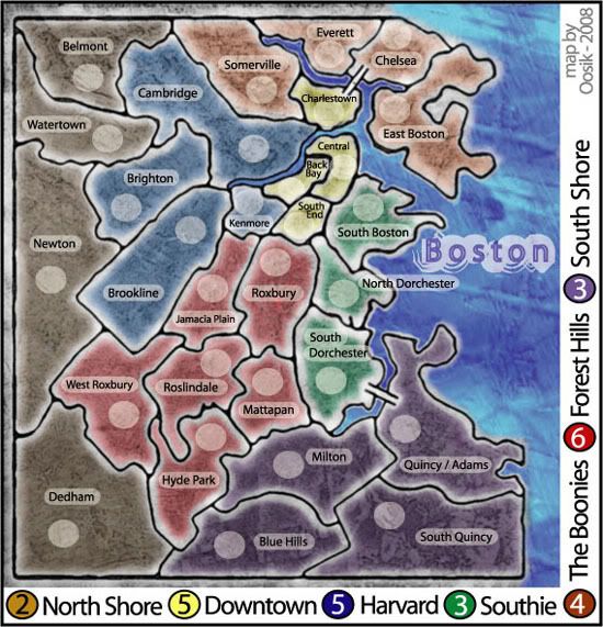
Boston Map - Version Four
-Added Charles
-made territory names horizontal and uniform
-made "Boston" horizontal
*did not add places like Fenway Park, Harvard Square, etc. Those territores are just to small for me to add in graphics.
*I think I'd like to be done here so that I may move on to other ideas. Unless of course there is some major thing that needs changing. Thanks!
*mmm, don' t know why it's cut off on the right; it isn't in my photobucketfile.
Boston Map - Version Three
-Added two bridges
-added better color to Mystic & Charles River
-Cleaned up boarders
-Changed texture & Colors
-...and other stuff changed probably
Boston Map - Version Two
7 Neighborhoods (continents)
29 Towns (territories)
Boston Map
-This is my first map and first idea ... please give feedback
Posted:
Fri Feb 29, 2008 3:46 amby Lone.prophet
wow looks very cool and different i say continue
Posted:
Fri Feb 29, 2008 4:04 amby edbeard
Hi there! You did manage to post this in the right place.
I'm not sure if you saw this or not, but take a look at the
How to Make a Map Handbook. It has a lot of info to help you out. one thing I'll point out is that your map is too wide at the moment for the small map version 600px is the max. you have plenty of space to move your legend to the top of the map and even zoom in a bit to make things slightly bigger.
Some questions.
1. Is this all based on reality? The places you chose to put borders I mean
2. Does this encompass the entire Boston area (I know you're from the area but we don't want someone coming in and complaining that their part of Boston wasn't included for some reason).
I know you're early on but some of these borders need more clarity. For instance, does everett touch charlestown? If not, do we really want a continent that has one border and is essentially all linear? (actually that's the only border-issue I had).
I haven't thought too much about the gameplay yet. But, I do notice there are no impassable areas. I'm not saying this is good or bad just that a few of the continents will be tough to hold. You did put make a few of the bonuses higher probably for this reason.
The only 'problem' I see is that a few of your continents are going to be easy to get from the drop. One continent with two territories, one with three territories, four with four territories. This isn't normally that big of a deal, but when you combine that with high continent bonuses it could be problematic. Imagine holding Southie or Downtown with a good drop. It would happen quite often I imagine. Getting a +5 or +6 would be quite bad for other players if you went first.
Bawstin map
Posted:
Fri Feb 29, 2008 4:36 amby oosik
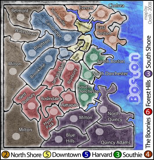
1. Yep, these are the actual town-lines. I used topagraphical map as a basis.
2. Yep, it's all of Boston. The 'north shore', 'western' & 'south shore', are all considered 'just outside of Boston'.
3. I agree .. the boarders need to be more defined (thanks). I would like to put 'impassable boarders'. I could do this with The Mystic River, and The Charles River.
4. I could probably break up the south shore into 4 territories if that would be better.
5. There is a very popular shuttle boat that many comuters use that goes from Quincy, to Central. Thought that might be a good ability ... Quincy can attack one way to Central.
6. Would like some 'fair' bonus suggestions.
Yeay, Boston
Posted:
Fri Feb 29, 2008 4:39 amby hufflepuff
I like it. I like the art style too. I like the idea of the Charles and Mystic Rivers ... maybe put the bridges ... don' t know if you could put the tunnels. Next you can make a MBTA Map ... lol.
Posted:
Fri Feb 29, 2008 12:07 pmby FreeMan10
Great first post! I'm excited to see what you do as you fix up the items mentioned already.
My only comment would be to bring the territories together - actually having them touch will help indicate where attack lines are.
Posted:
Fri Feb 29, 2008 12:50 pmby benny profane
i agree with much of what edbeard said.
the legend is waaaay too big.
i would scale that down, and use the space to make the actual map much larger.
also, i think those army circles are too small.
otherwise, good work!
keep it up.
Posted:
Thu Mar 06, 2008 6:18 amby morfam1
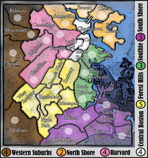
looks awesme Kev. I like the colors more and the legend.Paul Revere is agood idea. He pops out a bit.
Posted:
Thu Mar 06, 2008 4:43 pmby edbeard
hey don't forget to bump your thread with the latest update. basically it's pretty standard to post everything from your first post into your update bump post. Also, it doesn't hurt to tell people what you changed so anyone coming in can see what you've changed. Including a text link to your old versions (only in the first post) might be helpful too.
I'm not fond of your texture to be honest.
How come your borders in the western suburbs are different from everywhere else?
It'd be nice if you could smooth up those bridges.
I like the dude in the background. Paul Revere?
Looking good man. I still need more time to ponder gameplay but I don't see any big problems. Most likely some tinkering will happen.
Posted:
Thu Mar 06, 2008 5:44 pmby Qwert
Its look that yours plan is to finish these map in 2009(these what i see on map)
Posted:
Fri Mar 07, 2008 12:22 amby oosik
qwert wrote:Its look that yours plan is to finish these map in 2009(these what i see on map)
hmm, didn't understand that
Posted:
Fri Mar 07, 2008 2:28 amby Balsiefen
oosik wrote:qwert wrote:Its look that yours plan is to finish these map in 2009(these what i see on map)
hmm, didn't understand that
You have Map by oosik - 2009 written at the bottom.
Anyway, a very pleasing start for a map. On Jamacia plain however, you have your army shadow over the name, makes it hard to read.
Posted:
Fri Mar 07, 2008 3:58 amby casper
Where's the Charles River? Also, I think a Boston map would be much more exciting if it was focused on a smaller area that include the diverse neighborhoods of Boston as well as interesting water topography. If I only I had time to start one myself.
Some inspiration perhaps....
Massive base map for someone to use. Check this out!
http://www.radicalcartography.net/boston-f-g.tif

 http://www.radicalcartography.net/?bostonsquares
Posted:
Fri Mar 07, 2008 11:28 pmby oosik
Yep, I've see those maps ... the Charles river is there. I looked at many different maps, and was going to go with a closer view of Boston, but in the end, went with this one.
haha, I didn't notice that I put 2009.
Thanks for all the feedback so far. This is my first map...so I'll keep plugging away.
That's not Paul Revere...It's the George Washinton statue on Boston Common.
Posted:
Sat Mar 08, 2008 12:50 amby anyrose
I really like the Boston map. Can't wait to play it.
Where does one go to get teh software/plug ins/whatever to design a map? I want to see if I can do a MetroNYC one.
Re: Boston Map
Posted:
Sat Mar 08, 2008 3:54 pmby elgranmoky
i vote for this map, he is quite nice player too
Posted:
Sun Mar 09, 2008 8:15 amby mibi
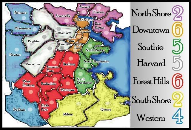
having grown up on this map, I can say that these are NOT Boston colors, unless its Easter.
Colors
Posted:
Mon Mar 10, 2008 6:02 amby oosik
mibi wrote:having grown up on this map, I can say that these are NOT Boston colors, unless its Easter.
Yeah, i grew up here too. I used 'orange,white, green' to represent the 'irish', then I didn't really know what else to use. The brown and yellow was for the Bruins.....pink and purple were used, just cause I couldn't think of anything else. I didn't want to use blue, because of the water.
You're welcome to 'suggest' colors that you feel should be in the map.
Posted:
Thu Mar 13, 2008 6:41 pmby RjBeals
Great job so far - unique & simple game play.
(edit)
Great songs on your myspace page. A true artist & musician.
Posted:
Fri Mar 14, 2008 2:05 amby oosik
RjBeals wrote:Great job so far - unique & simple game play.
(edit)
Great songs on your myspace page. A true artist & musician.
Thanks, I'm glad you enjoyed the music =)
map
Posted:
Fri Mar 14, 2008 5:35 amby morfam1
looks great - let's play it
Posted:
Fri Mar 14, 2008 12:35 pmby benny profane
hey dude, the map seems to be steadily improving, especially the colors.
some suggestions:
-you might consider toning down the glow on the borders. also, they're not quite uniform (thicker and brighter at certain points).
-what is the image on the water? i rather liked the statue...
-i would try to consolidate the legend info, instead of having it wrap around...maybe shrink it and fit it all on the bottom of the map?
-my personal opinion is that maps look better when all the territory names are horizontal. this is, of course, a real pain in the ass, and there are a few exceptions (great lakes, indochina...). if you don't want to go through the trouble, it probably won't hold you back. but i think the title of the map (Boston) should be horizontal.
-the colors of the legend could be more similar to the territory colors.
-none of the text needs to be as large as it is...like the territory names. if they were all the same size/color/font as Fenway, it would still work, and you'd have more room to place them.
that's all i can think of right now. keep up the good work!
Posted:
Fri Mar 14, 2008 2:23 pmby casper
You say you added "better color" to the Charles River but I don't see it?? Looks like all the other borders. Maybe you mean the Neponset?
I'd suggest adding actual water color to the Charles River like the Mystic and Neponset. Turn the Charles into a natural barrier between Cambridge and Central (rename Downtown?), Back Bay, Fenway, Brookline, Brighton, etc. Have bridges connecting some of them... but not all.
Posted:
Sat Mar 15, 2008 1:21 amby oosik
Thanks much...I'll get to it! =)
.
Posted:
Sat Mar 15, 2008 2:42 pmby Alyeska
I'm ready to take over the Boston hoods ... to bad it won't be ready for St. Patty's day. What's better than St. Patty's day in Southie!